
MS Excel
How to make graphs in Excel with various data easily
Everyone at some point in our lives has seen the need to make some kind of graph, but we have not been able to do it, because we do not have the knowledge to achieve it and that is why we are here.
We have needed these graphs both in our work environment and in students since most projects must be analyzed with this tool because we hope that by the time you finish reading this article you will know what a graph is and how to do it, thanks to us.
What is Excel?
First of all, Excel is nothing more than a program that is part of the Microsoft company, which was released to the world on September 30, 1985, and is still actually used by most institutions and users to this day.
From this program, you can create and even have the power to manipulate all kinds of data, use various formulas and even graphics. Well, basically that is its function, to be a spreadsheet. It can also be used from Windows, macOS, Android, and iOS, making it a fairly versatile program.
Now it also allows you to make graphs with that data, but what are these graphs? These are nothing more than a graphic representation of the values that we want, in order to have a visual comparison, much more understandable.

These have been used for many years because they are one of the most versatile tools in the program, and although there are other programs as an alternative, this is one of the most popular among all of them.
How to make a chart in Excel
- The first thing you should do is have your computer turned on and be on the desktop, there you will direct the mouse to the start menu that is in the lower-left part of the screen. You must press on it.
- Then look for the option called all programs and once it is in the list, scroll until you find the Microsoft office folder, if you don’t have it, you can download and install it.
- Then you just have to click on the Excel option and wait for the program to run.
- Now here you must enter the data in the corresponding boxes, or if you already have a spreadsheet with these data, just go from the desktop to the folder where the spreadsheet with said data is located.
- We must select the data of the boxes that we want to use, this is achieved by pressing the left mouse button and moving it between the chairs you want.
- As we already have our data in front of us, we must go to the horizontal menu and press “ insert “.
- At this point, you will be able to choose the type of graph you want from options such as pie, line, column, and even bar graphs.
- Once we select the rows and columns that we want, a small window will open showing the graph we choose and representing the data we select.
- And voila, you will be able to graphically observe all your data through a graph.
How to modify my chart?
Once we have our graphic, we can medicate it and design it to our liking, and for this, we must go to the horizontal menu and press on graphic design. From there you can choose other designs similar to the one that appeared to you.
Suppose that the circular graph model was chosen and you have followed all the steps mentioned above, but since the values are very similar, it does not differ which is greater or less, for this reason, we go to ” graphic design ” and press on percentage graph.
In this way, you will be able to see the percentage of each of the data that you entered and selected for this graph. It is also possible to highlight the side of the cake with a greater or lesser percentage because you simply have to press on the section and drag it out.
Once you have made that graphic you need, you should save it to ensure the backup of the document, because you should only click on the memory icon that is in the upper left, it will ask you in which folder or device you want to save it. You choose it and select “open”. This way your work and your graphic will be completely safe.
Types of Excel charts you can use
A chart is the best way to represent the data in a spreadsheet. In the Excel toolbar in the insert option, you will find the group of different types of graphs.
Pie or pie charts
The circular or pie graphs can display data in a graph in two or three dimensions, they also serve to represent data as a percentage. Having our numerical data already selected to enter in the pie, we look in the tool panel for the option to insert and in the graphics section, we click. In this way, the cake will be displayed and with right-click on the option to add data labels, the information will be displayed in value or in percentage.
Columns or bars
The column charts ranging from rectangular, cylindrical, conical, and pyramidal. Bar charts are very similar to column charts, but in column charts, they are represented by horizontal bars.

Having the data to work on at hand, we go to the option to insert in the tools panel and click on the two- and three-dimensional column chart whatever your preference. Then you start entering the data and you will immediately have your column or bar chart.
Comparative charts
For comparative graphs, the most common graph to use is the bar or column graph, then the data to be plotted is selected, but first, the design of the graphs has been chosen, and then data begins to be inserted to begin the comparison.
Linear and with variables: ascents and descents
They are commonly used to perform sequential data representations that drive a timeline. Having our data table with the variables to work with, we look for the insert icon and click on the line graph.
Then right-click and press the option to select a data source, first, we enter variable number one and then the next variable. With respect to the given values, it will be possible to obtain lines of ascents and lines of descents, that is, the line will be an ascent if the values are high or higher, while the descent line will have the lower or lower values of the data to be worked on.
Main Excel formulas to create your first chart
The repeat function allows us to repeat a text a certain number of times. With this function, you create a bar chart. In a table of values to work, it should be taken as a basis to graph the total of the values.
To start using the Excel formula such as repeat, we mark the equal key followed by the word repeat, we open parentheses and the assistant, where the function has two arguments, the text and the number of times.
In the text argument, we place the letter g and in the number of times we place a small operation, that is, a number divided by a thousand so that it returns a whole number. In this way, carrying out the same procedure until the table is finished.

Then we go to the letter change option, but before selecting the range to change letter, we select the webdings letter option and the font will change to a shape that will help represent a bar graph for each value.
On the other hand, to work with percentages, we open the wizard, and in the data arguments in the text we place the letter I followed by the number of times we place a value divided by a thousand, to the result we add the amperson sign (&) followed by quotation marks, space, quotation marks, and again the amperson sign (&).
Advantages of presenting data in Excel charts
Excel charts have a great advantage because they help represent data in a simplified, orderly presentation and better way.
A better understanding of the topic
Excel in its group of graphics improves the understanding of any topic to be explained, in such an effective way that anyone will understand.
Point emphasis
Each point signifies a piece of data on the graph and represents in a simple way the behavior of the data to be worked on.
Present various categories
The data to be worked on can be presented in different categories and you can represent them in the different types of graphs and you can choose the one of your preference, be it the representation of the data in both numerical or percentage form.

Surely you all know the Microsoft Excel application. Microsoft Excel is an application or software that is useful for processing numbers. As you already know, this application has a lot of uses and benefits.
The usefulness of this application is that it can create, analyze, edit, Rank, and sort several data because this application can calculate with arithmetic and statistics.
This tutorial will explain how to sort or rank data using Microsoft Excel.
How to Rank in Microsoft Excel
You can rank data in Microsoft Excel. By using the application, you can easily do work in processing data. Ranking data is also very useful for those who work as teachers.
Because this application can rank data in a very easy way and can be done by everyone. Here are ways to rank data in Microsoft Excel:
1. The first step you can take is to open a Microsoft Excel worksheet that already has the data you want to rank. In the example below, I want to rank students in a class by sorting them from rank 1 to 7 You can also rank according to the data you have.
2. After that, you can place your cursor in the cell, where you will rank the cells in the first order. You can see an example in the image below.
After that, you can write a formula to rank in Microsoft Excel in the fx column. And here’s the formula, =rank(number;ref;order) .
The meaning of the formula is = Rank Rank, which means it is a rank function. And (number; ref; order) means the initial cell number that has a value to be ranked, its reference, and the final cell number that has a value to be ranked, the reference.
The formula is =Rank(D3;$D$3:$D$9;0) in the example below. After entering the function, you can press the Enter key on your keyboard. And here are the results, namely the ranking on data number 1, which has a ranking of 1.
3. If you want to do the same thing to all data as in data number 1, you have to copy the previous column, and then you can block the column below it and click Paste. Then you can see the results. All the columns in the Rank entity have been ranked in such away.
4. The results above are not satisfactory because the data is still not sorted, so it looks messy. We must make it sequentially according to the ranking from the smallest to the largest, and this example must be sorted from rank 1 to rank 9.
The way to sort it is to block the contents of all tables, but not with the column names and the contents of the column number.
5. After that, you can do the sorting by going to the Editing tool, clicking Sort & Filter, and then clicking the Custom Sort option…
6. Then the Sort box will appear, where you have to choose sort by with the Rank option, some kind on with the Values option, and order with the Smallest to Largest option. After that, you can click OK.
7. Below is the result of the sorting we have done above. In this way, the data that has been ranked will be sorted according to its ranking.
That’s the tutorial on how to rank using Microsoft Excel. Hopefully, this article can be useful for you.
Microsoft Office Excel is useful as a spreadsheet worksheet document famous for microcomputer activities on Windows platforms and other platforms such as Mac OS. With this excel, the data can be more structured and have handy capabilities.
As for the other product, Word is better known as a word processing application. Where has a WYSIWYG concept, namely ” What You See is What You Get.” This application program is also one of the best made by Microsoft that people on various user platforms widely use.
With the presence of these two application programs, it is expected to make work easier and make your work more optimally as desired.
Like wanting to move an Excel table to Word, how do you get the table you’re moving to match its source. This article will discuss how to transfer tables from Excel to Word quickly and how you want.
How to Move a Table from Excel to Word
One of the features provided to solve this problem is the copy-paste feature, which you must be familiar with. This copy function is to copy something and paste it by pasting it according to what has been copied. Paste also has several more functions, including the following:
Keep Source Formatting: Paste function in this option to maintain the appearance of the original Text according to the source that has been copied.
Use Destination Styles: This option is to format the text to match the style applied to the Text.
Link & Keep Source Formatting: In this option to maintain the link to the source file and display the original text according to the source that has been copied
Link & Use Destination Style: This function maintains a link to the source file and uses a text format that matches the style applied to the Text.
Keep Text Only: This option is only for pasting Text only. So all the formatting of the original text will be lost.
It’s a good idea to determine if you want to move the Excel table to Word with which function you need more. Let’s go straight to the steps to move an Excel table to Word.
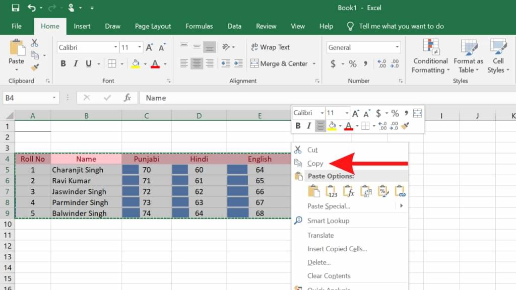
1. Open your Excel file that contains the document you want to move to Word.
2. Before copying the table, make sure you give the table a border so that when it is transferred to Word, the results are neat. Block the table, then click Borders as indicated by the arrow.
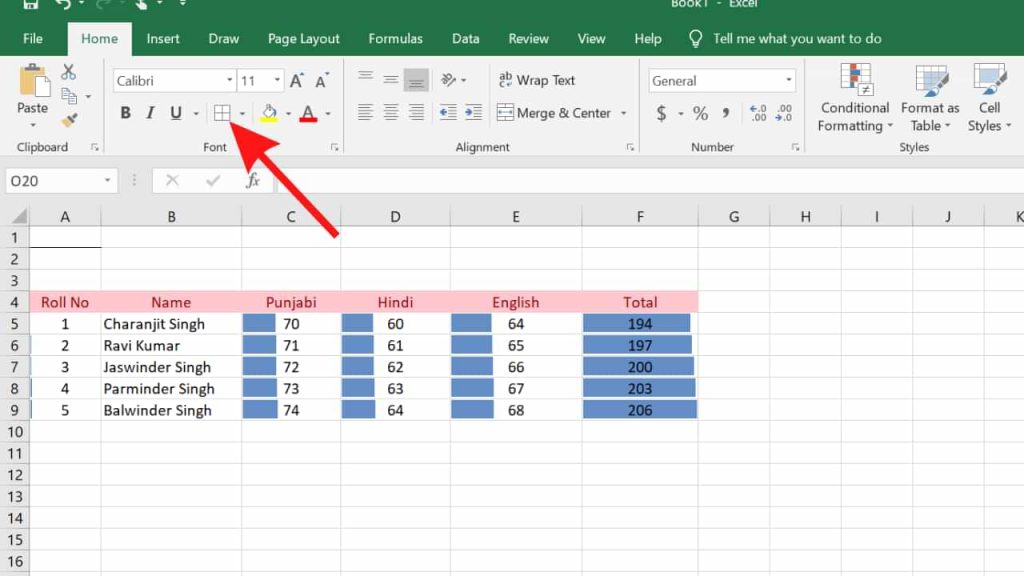
3. Then select All Borders.
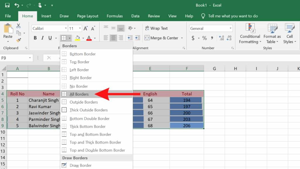
4. The table has been given a border for a neater result. Next, block the table, then right-click> Copy. Or you can use the Ctrl + C keys.
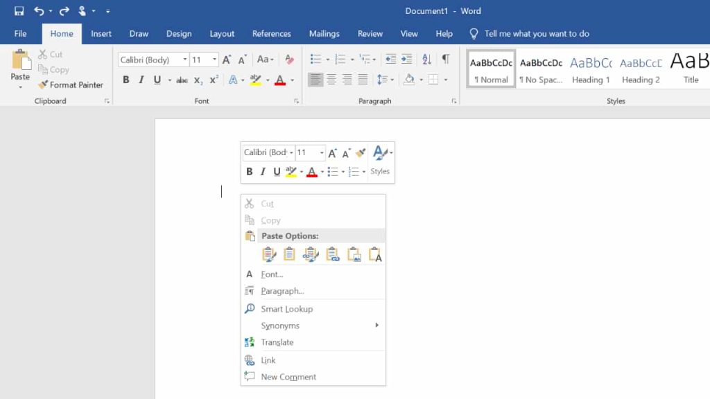
5. In the Word document, just right-click> Paste. Or you can press Ctrl + V.
6. The result will be like this, exactly like the one in Excel.
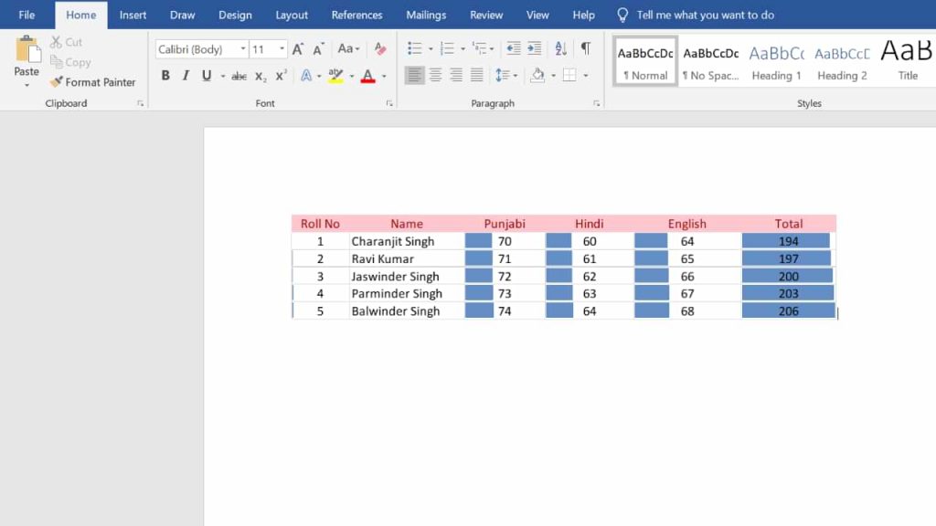
This is a tutorial on how to move tables from Excel to Word. Many features have never been used at all. So it’s a shame if we don’t try the features provided, moreover these features are handy for us. So many tutorials this time, hopefully, are useful for you.

How to create a table in Microsoft Excel is very easy, you know, because basically, Excel consists of tables and a number processor.
The use of internal tables in this number processing software has become one of the things that are definitely needed, guys. Especially if you play with a lot of data in it.
However, until now there may still be many who do not know how to make it. Therefore, we will provide a complete tutorial for you.
But before going into the steps, you need to know a few things about the following table.
Table of Contents :
HOW TO CREATE A TABLE IN MICROSOFT EXCEL
Before creating a table, make sure you already have the data and already know what kind of table you want to create.
Btw, do you know what a table is? And how is it different from tables in other software?
What is a Table in Excel?
Tables are a feature that can help you group data together, so the data you have is easier to read.
Like tables in general, this number processing software also consists of columns and rows that you can adjust the amount according to your needs.
Table Functions in Microsoft Excel
The main function of a table in Excel is to add rows of data without changing the writing structure that has been created.
No less important, the tables in this number processing software can serve to make your data look more attractive and easy to understand.
You can edit the table as needed, so the existence of the table feature is very important for making a data report.
How to Create a Table in Microsoft Excel
To make it is quite easy, you know. Do not believe? Take a look at the tutorial below.
If you think how to create a table in Microsoft Excel requires additional applications, then you are wrong guys. Because you can create tables directly, without third-party applications. So, this is the way.
- The first step, open Microsoft Excel on your PC.
- The block of data that you want to insert into the table.
- Then, click Insert – Table.
- Then, make sure the data you want to enter into the table is correct.
- Finally, click OK.
Finished! If you think the table made is less attractive, you can edit it on the Table Style menu. In addition, you can also change the color of the column to make it easier for others to read.
How? How to make a table in Microsoft Excel is really easy, right?
So, good luck with that!


Who Invented Lithium ion Batteries
SHARE More Imagine a world without smartphones, laptops, or electric cars. Crazy, right? These amazing devices rely on a powerful...


Who Invented SSD : A Journey From Invention To Innovation
SHARE More The dominance of Solid State Drives (SSDs) in modern data storage is undeniable. Their lightning-fast performance, superior reliability,...


Google Gemini: Your Super-Smart AI Sidekick (Made Easy!)
SHARE More Imagine a helpful friend who can write emails, translate languages, dream up creative ideas, and even write code!...


Who Invented Gorilla Glass for Mobile: Unveiling the Inventor and Its Impact
SHARE More In the ever-evolving landscape of mobile technology, Gorilla Glass has emerged as a revolutionary material, providing durability and...


The Evolution of Touch Screen Technology: A Journey into its Inventors and Innovations
SHARE More Touch screen technology has become an integral part of our daily lives, seamlessly blending with our smartphones, tablets,...


The Evolution of Memory Cards: Unraveling the Inventors Behind the Innovation
SHARE More In the fast-paced world of technology, memory cards have become an indispensable part of our daily lives. From...


Who Invented Sim Card | The Origin and Inventor of the SIM Card: A Revolutionary Communication Breakthrough
SHARE More In today’s digitally interconnected world, the SIM card stands as a tiny yet indispensable component of our daily...


Who invented Walkie-Talkie | Exploring the Wonders of Walkie-Talkies: A Simple Guide for Beginners
SHARE More Walkie-talkies, often fondly referred to as “woki tokies,” are incredible communication devices that have stood the test of...


Who Invented Camera Lens : A Revolutionary Innovation in Photography
SHARE More The invention of the camera lens stands as a pivotal milestone in the history of photography, fundamentally altering...


The Evolution of Radio Broadcasting: Who Invented Radio?
SHARE More Radio broadcasting has been a cornerstone of communication, entertainment, and information dissemination for over a century. It revolutionized...
-

 Phones5 years ago
Apple iPhone 11 (2019) – Release, Info, Leaks, Rumors
-
![Huawei's New Operating System is HarmonyOS [ Officially ],harmony os,huawei new operating system, huawei harmony OS,](https://www.thedigitnews.com/wp-content/uploads/2019/08/Screenshot__2285_-removebg-preview-2-1-400x240.png)
![Huawei's New Operating System is HarmonyOS [ Officially ],harmony os,huawei new operating system, huawei harmony OS,](https://www.thedigitnews.com/wp-content/uploads/2019/08/Screenshot__2285_-removebg-preview-2-1-80x80.png) Phones5 years ago
Phones5 years agoHuawei New Operating System is HarmonyOS [ Officially ]
-

 News5 years ago
Belle Delphine bath water – Instagram Model Sells Used Bathwater For 30$ To Their Loyal Followers
-

 Tech5 years ago
Levi’s Bluetooth Jacket Lets You Control Your Smartphone